

Business Intelligence (BI) is the practice of transforming data into actionable insights that empower business leaders to enhance overall performance. Once of the most important phases of this process is the data exploration and visualization phase. It entails the organization and transformation of data into meaningful information through reporting. To make data more understandable, BI professionals create data visualizations such as charts, graphs, and dashboards. These visual representations help decision-makers quickly grasp complex information. That's where Navicat BI comes in. Formerly known as Navicat Chart Creator, Navicat BI produces interactive dashboards that summarize the insights gained. Workspaces may be easily shared with colleagues and business leaders to make informed decisions on both operational (day-to-day) and strategic (long-term) matters. Today's blog article will touch upon a few of Navicat BI's many features.
Choose from a Variety of Data Sources
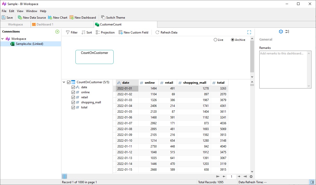
Navicat BI lets you specify and integrate data from a variety of data sources with ease. Not only does it come with pre-built data connectors for databases such as MySQL, PostgreSQL, SQL Server, Oracle, SQLite, MariaDB, MongoDB and Snowflake, but it can also import data from any ODBC data sources including Sybase and DB2.
Data sources are not limited to databases either; data may reside within external files such as Excel, Access, CSV, as well as from data stored on your computer, network, or a URL.
Regardless of data source type(s), charts are updated in real time so that they always reflect any changes in the underlying data.
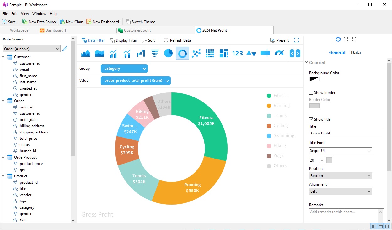
Custom Charts
To better inspire your organization to make better decisions, Navicat BI provides a wealth of different chart types to best illustrate your data in a meaningful way. These include Bar Charts, Line/Area Charts, Bar/line Charts, Pie charts, Heatmap/Treemap, Pivot Table, Waterfall Chart, Scatter Chart, Value, Control, KPI/Gauge, and more. By selecting the best chart type for your data ensures that your questions are easily answered and your presentations convey the message you wish to communicate.
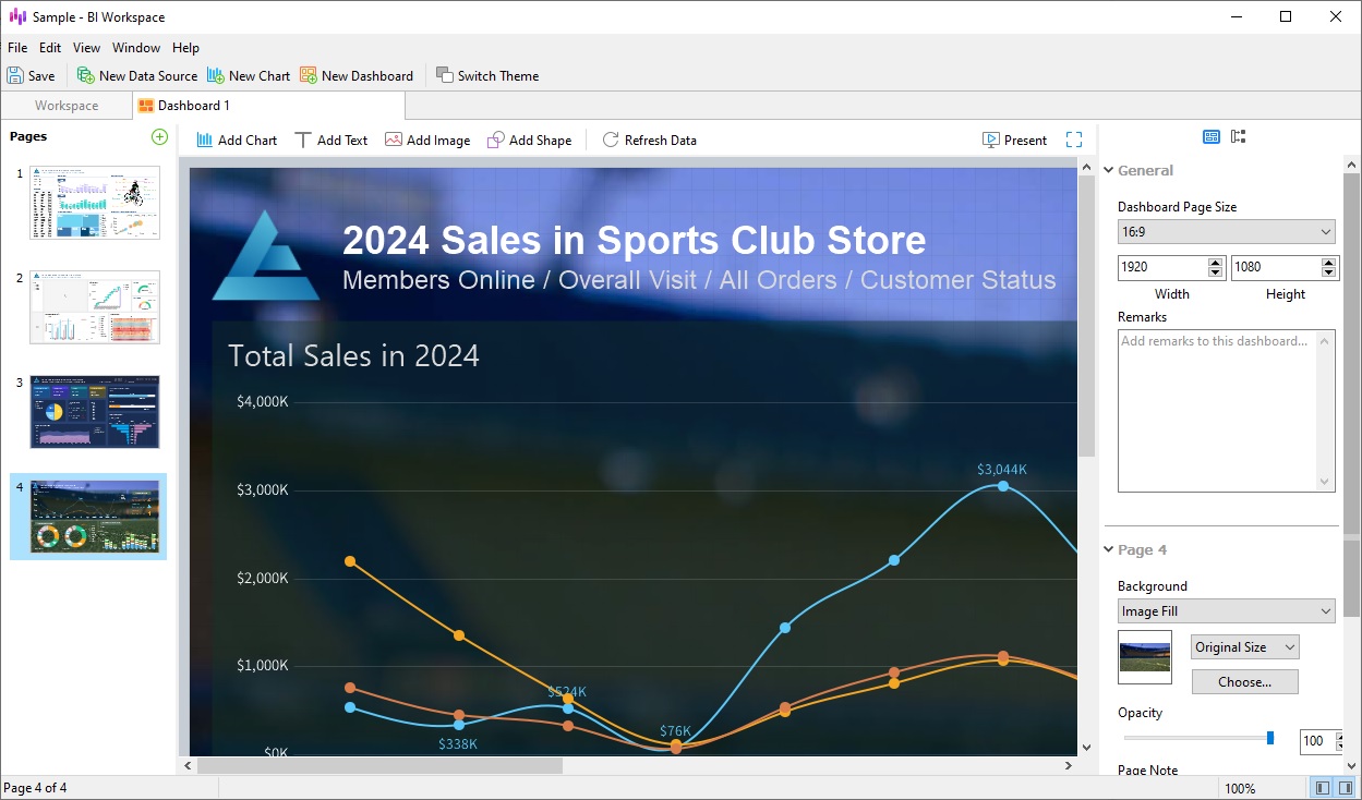
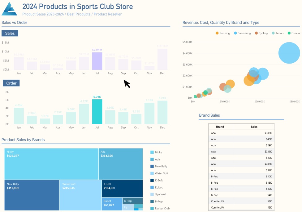
Effective Dashboards
Dashboards provide an interactive display of your charts. A single dashboard may combine multiple views of data to glean richer insights. All of the charts on a dashboard that share the same data source may be interconnected so that selecting a data point on one of the charts instantly updates all the other charts to reflect your selection.
Collaboration Made Easy!
Navicat BI is fully integrated with Navicat Collaboration, allowing you to synchronize your BI workspaces to Navicat's cloud solutions. You can then invite your teammates to the project, where they can create and edit together.
Conclusion
This blog article covered just a few of Navicat BI's many features. In future articles, we'll delve into how to use Navicat BI in greater detail.
Navicat BI is available as a stand-alone product and is also integrated into Navicat Premium and Enterprise Editions. You can download it for a 14-day fully functional FREE trial. It's available for Windows, macOS, and Linux operating systems.


